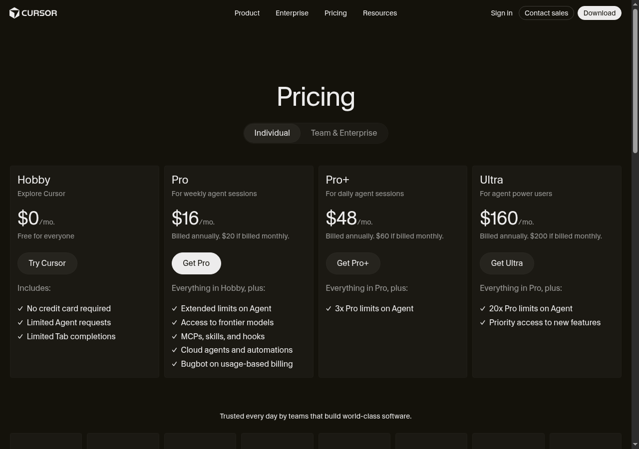
Needs work — Missing product context and social proof for B2B buyers
The bottom line
80% of visitors would scroll or leave — not because the pricing is wrong, but because the page never explains what Cursor actually does. Non-developer decision-makers (ops managers, healthcare, finance) hit terms like 'Agent sessions,' 'MCPs,' and 'Bugbot' and immediately self-select out. The 20% who convert are already product-aware; everyone else needs context this page doesn't provide. Fix the value proposition above the pricing cards and you unlock the audience currently bouncing on first contact.
“Those company logos feel trustworthy, and I'd test the free tier today. Once I hit the limits, I'd probably convert to Pro — the pricing model actually makes sense for my budget.”
55% would scroll — missing case studies and real-world proof stall deeper exploration
“I see SOC 2 Type II mentioned, but the page doesn't show which actual companies use this setup. Case studies from enterprises managing similar data would actually help me decide.”
25% would leave — jargon misalignment signals product isn't for non-technical roles
“The page throws around 'Bugbot' and 'MCPs' like I should know them, but that's pure software talk. I'm a pharmacist, not a developer — this clearly isn't built for me.”
What's working
These elements tested well — preserve them as you iterate.
—Transparent pricing with annual/monthly toggle and no hidden fees — reduces a common B2B friction point immediately.
—Four-tier structure with clear hierarchy (Hobby → Pro → Pro+ → Ultra) follows established SaaS patterns that evaluators recognize and trust.
—Free Hobby tier with 'No credit card required' gives skeptical evaluators a zero-risk entry point before any budget conversation.
—White 'Get Pro' CTA button creates strong visual hierarchy that anchors attention on the intended conversion target.
How to make this design stronger
Here's what to fix first — then resubmit and we'll verify.
critical
Add a product explainer above the pricing cards
The top hesitation across the majority of non-converting visitors is not knowing what Cursor does. A 2-sentence value proposition — 'Cursor is an AI code editor that helps engineering teams ship faster. Built for developers, used by teams at [Logo A], [Logo B].' — placed between the 'Pricing' heading and the tier toggle would immediately filter and qualify the right audience before they hit the cards.
If you skip this: The 80% who scroll or leave will continue to do so — you're paying to acquire an audience you immediately lose to a missing sentence.
Suggested fix
—Insert a 2-line subheading in white (#FFFFFF), 18px, font-weight 400, centered, between the 'Pricing' H1 and the Individual/Team toggle — e.g., 'Cursor is an AI-powered code editor. Pick the plan that fits your team's pace.'
—Add 3 named, identifiable customer logos (minimum 120px wide, full opacity) directly below the subheading — replace or reposition the cut-off bottom logos to this high-visibility slot.
—Include one quantified outcome next to the logos — e.g., 'Used by 50,000+ developers' or 'Saves teams X hours/week' — in #A0A0A0 at 14px to anchor credibility without visual clutter.
—A/B test this block against the current header-only layout; measure scroll depth past the toggle and CTA click rate as primary signals.
recommended
Replace generic social proof with specific, readable evidence
The 'Trusted every day by teams that build world-class software' line and the cut-off bottom logos provide zero credibility signal to B2B evaluators comparing vendors. Roughly 55% of visitors are still scrolling — they're looking for this evidence and not finding it. Named logos, a review count, or a single attributed quote would convert a meaningful slice of that engaged group.
If you skip this: Scrollers who reach the bottom and find no credible proof will exit — you're losing the most engaged segment of your non-converting audience.
Suggested fix
—Replace the generic tagline with a specific attributed quote — e.g., '[Name], Engineering Lead at [Company]: "We cut PR review time by 40% in the first month."' — in 16px italic white, centered, above the logo row.
—Ensure all logos are full-width visible (minimum 100px wide, 40px tall, white/light treatment for dark background) — no cropping at any viewport above 375px.
—Add a review count badge (e.g., '4.8/5 on G2 — 1,200+ reviews') in a pill-shaped container, #1A1A1A background, #FFFFFF text, 13px, positioned inline with the logo row.
—If named logos are unavailable, use a developer community stat — e.g., 'Downloaded by 500,000+ developers' — as a placeholder until logo rights are secured.
consider
Add inline tooltips or a 'Which plan is right for me?' guide to the tier cards
Feature descriptions like '3x Pro limits on Agent' and 'MCPs, skills, and hooks' are meaningless without baseline context. Even product-aware visitors must manually infer tier differences, which increases decision anxiety and delays commitment.
Suggested fix
—Add a (?) tooltip icon in #A0A0A0 at 12px next to each jargon term — on hover/tap, show a 1-sentence plain-language definition (e.g., 'Agent: AI that completes multi-step coding tasks autonomously').
—Add a 'Most Popular' badge to the Pro card in #F5C518 background, #000000 text, 11px bold, positioned top-center of the card.
—Consider a 'Help me choose' text link below the toggle in 13px #A0A0A0 that expands a 3-question use-case matcher (team size, usage frequency, developer vs. manager) — this directly addresses the wrong-audience drop-off.
—Test tooltip engagement rate as a proxy for decision anxiety before committing to the full use-case matcher build.
Compliance & Accessibility
Compliance3 flags
Privacy Policy Disclosure(Missing Privacy Policy And Terms Link At Point Of Purchase) — No visible privacy policy or terms of service link near the CTA buttons. GDPR and CCPA require disclosure before collecting payment or account data.
Payment Security Disclosure(No Payment Security Or PCI-DSS Signal Visible) — No SSL badge, PCI-DSS indicator, or payment processor logo visible on the pricing page. Enterprise buyers — especially those handling PII — flag this as a trust gap.
Enterprise Data Handling(SOC 2 And GDPR Compliance Not Surfaced On Pricing Page) — One persona explicitly noted SOC 2 Type II as a decision factor. If Cursor holds this certification, it must be visible on the pricing page to influence enterprise evaluation.
Not legal advice — flags for your compliance team.
Accessibility4 notes
Dark Theme Contrast — Dark background with gray secondary text on tier cards risks falling below WCAG 2.1 AA 4.5:1 contrast ratio for body text. Requires contrast audit across all card text colors.
Keyboard Navigation — No visible focus indicators on CTA buttons or toggle tabs. Keyboard-only users cannot confirm which element is active — fails WCAG 2.1 Success Criterion 2.4.7.
Logo Row Alt Text — Cut-off logos at page bottom have no identifiable alt text context. Screen readers would encounter empty or meaningless image descriptions.
Toggle Accessibility — Individual/Team & Enterprise toggle must have ARIA role='tablist' and role='tab' markup to be operable by screen readers. Visual-only toggle state is insufficient.
Re-check after fixes
Fixed some issues? Check them off, upload your updated design, and we'll verify just these findings.