Trust gaps and vague promises are killing 95% of conversions.
Mobile-first fintech users — security-conscious, compare options carefully
Persona template: Fintech / Payments User
95% would scroll or leave — mostly looking for proof — reviews, security badges, fee schedule details
High — Consistent hesitation pattern across all audience reactions
Needs significant work — Critical trust and compliance gaps block launch
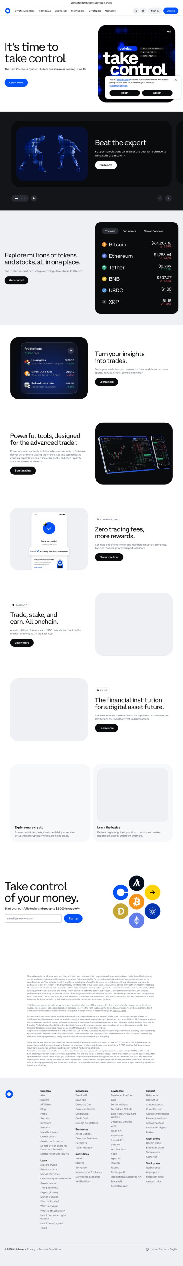
Only 5% of users convert — and the audience told you exactly why: no independent reviews, no security signals, and a vague signup offer ('up to $2,000 — based on what?') that reads as a red flag, not a reward. The 95% who scroll or leave aren't confused about the category — they understand it's a crypto trading platform — they just don't trust it enough to hand over financial data. The 'System Update Announcement' in the hero and cryptic Accept/Reject buttons actively reinforce that distrust. Fixing trust signals alone could meaningfully move conversion; leaving them broken will not.
“The interface feels clean and the crypto prices are right there — no guessing. I like that it shows real data instead of just hype.”
“The 'zero trading fees' claim is specific enough to act on. Brand recognition plus straightforward value prop — I'd click 'Get started' to compare.”
“Where are the independent reviews? I see claims about the platform, but nothing proving this isn't another slick pitch designed to separate me from money.”
These elements tested well — preserve them as you iterate.
Here's what to fix first — then resubmit and we'll verify.
Add social proof and security trust signals above the fold
The single most-cited reason users don't convert is zero visible proof this platform is safe or legitimate. Add a Trustpilot star rating (minimum 4.0+), a user count ('10M+ users'), and at least one security badge (SOC 2, SSL) within the hero section — above the fold on both desktop and mobile. This directly addresses the hesitation cited by the majority of non-converting users.
If you skip this: Security-conscious users will continue to exit at the hero — no downstream fix recovers them.
If regulated: CFPB/UDAP: Any displayed review counts or ratings must reflect actual verified data. Do not fabricate or round up figures.
Clarify the $2,000 signup offer with explicit eligibility terms
The 'up to $2,000 in crypto' offer is generating skepticism, not excitement — users want to know what 'up to' means and what actions trigger the reward. Add a one-line eligibility summary directly beneath the offer claim (e.g., 'Earn up to $2,000 by completing qualifying trades — see terms') and link to a full terms page. This addresses the 'vague promises' hesitation cited repeatedly.
If you skip this: The offer reads as bait-and-switch to cautious users, actively reducing trust rather than building it.
If regulated: UDAP/FTC: Promotional claims with 'up to' language require clear and conspicuous disclosure of eligibility conditions. Absence of terms linkage is a compliance risk.
Consolidate competing CTAs into a single primary conversion path
Seven-plus CTAs ('Trade now,' 'Get started,' 'Learn more,' 'Sign up,' 'Start trading') create decision paralysis for users who are already hesitant. Consider designating one primary CTA ('Get started') in a distinct color (#1652F0 at full opacity) and demoting secondary CTAs to ghost/outline style — this reduces visual noise without removing conversion paths.
Not legal advice — flags for your compliance team.
Fixed some issues? Check them off, upload your updated design, and we'll verify just these findings.
Save your work and unlock re-check
Sign up free →For your VP, stakeholders, or anyone who wants the full picture.
Did this review help you improve your design?
Generated by Prior.Run — Know before you build.