Apple's brand carries this page, but pricing opacity kills 86% of conversions.
Broad consumer audience — mix of tech-savvy and casual users, mobile and desktop
Persona template: General Consumer
86% would scroll or leave — mostly looking for pricing, cancellation terms, or third-party validation not visible in the hero
High — Consistent hesitation patterns across audience reactions
Needs work — Pricing and social proof gaps block majority of conversions
14% convert — the rest scroll or leave because they can't answer two basic questions: what does this cost, and does it actually deliver? Apple's brand authority gets users to the page and keeps them curious, but 'one lower monthly price' without a number is a trust gap, not a value prop. Those who scroll are hunting for pricing, reviews, or cancellation terms they never find. Fix the pricing visibility and add even minimal social proof, and this page has the structure to convert meaningfully higher.
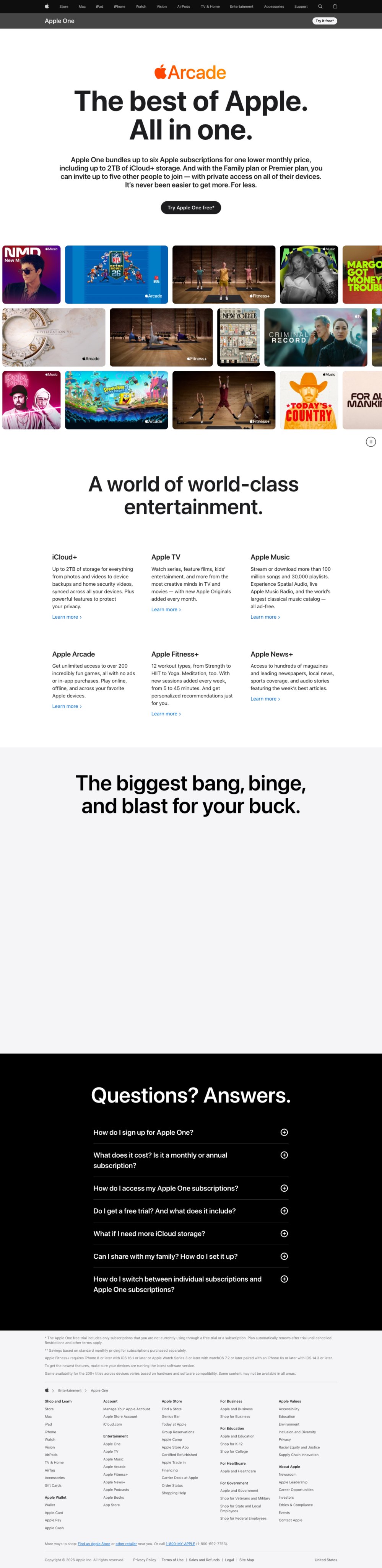
“The colorful app tiles and 'Try Apple One free' button feel right for me. The family plan angle resonates — I can share with my son, and the free trial removes the risk. I'll click.”
“The hero says 'one lower monthly price,' but I need exact numbers — per tier, what's included, what's not. Without that breakdown, I can't evaluate if this actually saves money versus buying separately.”
“No reviews, no ratings, no third-party validation anywhere. I see Apple's logo, but where's the evidence this bundle actually delivers? How do I know the cancellation process before I sign up?”
These elements tested well — preserve them as you iterate.
Here's what to fix first — then resubmit and we'll verify.
Surface pricing tiers visibly above the fold or immediately below the hero
Pricing opacity is the single most-cited hesitation — users explicitly say they cannot evaluate the bundle without a number. A meaningful slice of the 62% who scroll are looking specifically for cost; they won't find it and many will exit. Add a three-column plan comparison (Individual / Family / Premier) with monthly prices in at least 18px type, positioned directly below the hero CTA.
If you skip this: Cost-conscious users — a large share of the non-converting 86% — will continue to exit rather than click blind into a sign-up flow
If regulated: FTC guidelines on subscription pricing require clear disclosure of recurring charges before enrollment — hiding pricing behind a CTA click creates regulatory exposure
Add a social proof module — subscriber count or aggregate rating — near the hero CTA
Zero social proof is the second most-cited hesitation. Users explicitly say they need third-party validation before trusting the bundle delivers. Research shows social proof near a CTA can lift conversion by up to 34%. A subscriber count ('Join over 900 million Apple subscribers') or aggregate service rating placed within 200px of the hero CTA would directly address this gap for the skeptical segment.
If you skip this: Users who don't recognize the bundle's value from brand alone will continue to scroll looking for validation they never find — and exit
If regulated: Any subscriber count or rating claim must be accurate and current — verify figures before publishing
Add inline cancellation and trial terms to the hero — not just the FAQ
A segment of non-converters cite commitment fear and unclear exit terms as blockers. The FAQ answers these questions, but most users won't scroll that far. A single line of 13px reassurance text ('Free for 1 month. Cancel anytime. No commitment.') placed directly below the CTA button costs nothing to implement and removes a stated objection at the moment of decision.
Not legal advice — flags for your compliance team.
Fixed some issues? Check them off, upload your updated design, and we'll verify just these findings.
Save your work and unlock re-check
Sign up free →For your VP, stakeholders, or anyone who wants the full picture.
Did this review help you improve your design?
Generated by Prior.Run — Know before you build.