
Prior.Run
Prior.RunKnow before you build.
·
Design AuditExperiment 314
Design Audit·
60% would click the CTA40% would scroll or leave
v1 · Jun 3, 2026 · 1:34 AMOptimizing for: Conversion rate
Design Audit · Single Variant

Strong brand, but vague claims and thin proof stop B2B customers from buying.

B2B decision-makers evaluating software — value ROI, peer validation, and specifics

Persona template: SaaS Buyer (B2B)

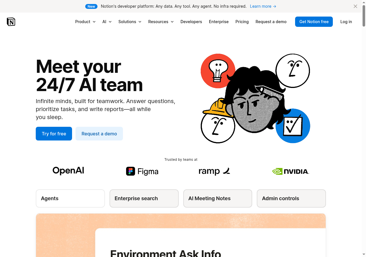
Hypothesis: Does the Notion AI page make a knowledge worker want to try it?

60%
would click the CTA
40% would scroll or leave — mostly looking for pricing, use-case specifics, and deeper proof before committing
Confidence

Directionalclear pattern worth deeper validation

Readiness

Needs workTrust gaps and specificity failures block skeptical evaluators

The bottom line

60% of visitors are willing to convert, but the 40% who scroll or leave are telling you exactly why: the value proposition is too vague, social proof is too thin, and enterprise buyers can't find the security and pricing signals they need to justify moving forward. The OpenAI and NVIDIA logos do real work, but logos without quotes, metrics, or case study hooks don't close the gap on a 3-5 vendor shortlist. Audience segments outside tech ops — policy analysts, lean teams, non-startup verticals — see nothing on this page built for them, which quietly shrinks the addressable audience. Fix the specificity and proof layers and this page can convert meaningfully higher.
302sto decisionvs.4–6 weeks for a live A/B test
Design audited
Design under review
What our users said
60% engaged positively — specific compliance credentials build trust over marketing claims

The 'no training on your data' answer with actual SOC 2 and ISO 27001 audits — that's enforceable, not just a tagline. I'll start the free trial.

30% would scroll — proven vendor logos and automation benefits prompt deeper exploration

Meeting notes and reporting automation hit exactly where I'm hurting with weekly status reports. NVIDIA and OpenAI using it, free trial to start? Yeah, I'm scrolling deeper.

10% would leave — misaligned use cases signal product isn't built for their workflow

Every use case here — onboard a hire, triage feedback, resolve Slack tickets — is for tech ops. I draft policy briefs for a living. 'Automate weekly reporting' probably means product metrics, not policy analysis.

What's working

These elements tested well — preserve them as you iterate.

High-caliber logo social proof — OpenAI, NVIDIA, Figma, Ramp — immediately signals enterprise legitimacy and reduces perceived risk for tech-adjacent buyers.
Dual CTA strategy ('Try for free' + 'Request a demo') correctly serves both self-serve and sales-led buyer journeys without forcing a single path.
Clean visual hierarchy guides the eye logically from headline to subheading to illustration to CTAs with minimal cognitive load.
Feature tabs (Agents, Enterprise search, AI Meeting Notes, Admin controls) give decision-makers a quick functional taxonomy above the fold.
How to make this design stronger

Here's what to fix first — then resubmit and we'll verify.

critical

Replace vague subheading with a specific, outcome-anchored value proposition

The subheading 'Infinite minds, built for teamwork' is pure marketing language — it tells skeptical B2B evaluators nothing actionable. The audience segments most likely to scroll or leave cite vague use cases as their primary hesitation. Rewrite to name a concrete outcome, a time saved, or a workflow replaced — something a regional manager or ops lead can immediately map to their pain.

If you skip this: Skeptical evaluators move to the next vendor on their shortlist without clicking either CTA.

Suggested fix
Replace 'Infinite minds, built for teamwork' with a specific outcome line, e.g., 'Cut weekly reporting time by 3+ hours — meeting notes, status updates, and task triage, automated.' Set at 20-22px, font-weight 400, color #4D4D4D.
Add a single supporting stat directly below the subheading in 14px text, color #6B6B6B — e.g., 'Trusted by 10,000+ teams across 50+ countries' or a verified time-saved metric from a customer.
Remove or demote 'All while you sleep' — this phrase reads as hyperbolic to risk-averse buyers. Replace with a grounded benefit clause tied to the new stat.
A/B test two variants: one outcome-focused (time saved), one workflow-focused (specific job-to-be-done like 'automate meeting notes and weekly reports').
recommended

Add at least one customer quote with a named role and a measurable outcome beneath the logo row

Company logos alone don't explain why those teams chose Notion — and for the meaningful slice of visitors who scroll past the hero looking for proof, there's nothing to catch them. A single testimonial from a Director or VP at one of the listed companies, paired with a specific metric, would do more conversion work than the entire illustration. This directly addresses the thin social proof hesitation cited across multiple audience segments.

If you skip this: Visitors who scroll past the hero find no proof layer and exit before reaching feature tabs.

Suggested fix
Insert a single testimonial block immediately below the logo row. Format: pull quote in 18px italic, attribution in 13px regular (Name, Title, Company). Background: #F7F7F7, padding 24px, border-radius 8px.
Quote must include a specific metric or outcome — e.g., 'We cut our weekly reporting cycle from 4 hours to 45 minutes.' Generic praise ('We love Notion') will not move skeptical evaluators.
Source the quote from a recognizable logo already on the page (OpenAI, Figma, Ramp, or NVIDIA) to compound the existing credibility signal.
If a named quote isn't available immediately, use an aggregate stat as a placeholder — e.g., 'Teams using Notion AI report saving X hours per week on reporting' — and flag for legal review before publishing.
consider

Add a one-line security/compliance signal near the CTAs for enterprise evaluators

Enterprise buyers — especially those in regulated industries or with data sensitivity concerns — are looking for SOC 2 or GDPR signals before they click 'Try for free.' A small trust badge or a single line like 'SOC 2 certified · No training on your data' placed at 12px below the CTA pair costs nothing to implement and directly addresses a hesitation that surfaced in the audience reactions.

If regulated: Ensure any compliance claim (SOC 2, GDPR, HIPAA) is current and audited before publishing. Outdated certifications create legal exposure.

Suggested fix
Add a single line of microcopy at 12px, color #6B6B6B, centered below the two CTA buttons: 'SOC 2 certified · No training on your data · GDPR compliant'
Optionally add 1-2 small certification badge icons (16x16px) inline with the text to increase visual scannability.
Link the line to the Trust & Security page so enterprise evaluators can self-serve deeper due diligence without leaving the page flow.
Compliance & Accessibility
Compliance3 flags
AI Claims Substantiation(Unsubstantiated AI Performance Claims)Claims like 'Answer questions, prioritize tasks, write reports — all while you sleep' imply autonomous AI performance without qualification. FTC guidelines on AI marketing require claims to be truthful and substantiated. Add a qualifier or link to documented capability scope.
Data Privacy Transparency(Missing Above-The-Fold Data Use Disclosure)No visible statement about data handling, training opt-outs, or subprocessor agreements in the hero. GDPR Article 13 and CCPA require clear disclosure of data use intent. Enterprise buyers in regulated industries will not proceed without this signal visible early in the page.
Trial Terms Opacity(Undefined Free Trial Terms)The 'Try for free' CTA provides no indication of trial duration, credit card requirement, or feature restrictions. FTC guidelines on free trial offers require material terms to be clearly disclosed before enrollment.

Not legal advice — flags for your compliance team.

Accessibility3 notes
Contrast Ratio RiskThe gray outlined 'Request a demo' button and secondary navigation text links may fall below the WCAG 2.1 AA minimum contrast ratio of 4.5:1 against the white background. Exact hex values are not confirmed from this view, but the visual weight suggests a risk.
Illustration Alt TextThe hero illustration (cartoon characters with icons) carries implicit meaning about the product. If rendered as a single image without descriptive alt text, screen reader users receive no equivalent information. Alt text should describe the functional concept, not just 'illustration.'
Feature Tab Keyboard NavigationThe pill-style feature tabs (Agents, Enterprise search, AI Meeting Notes, Admin controls) must be keyboard-navigable and announce their selected state via ARIA attributes. Tab-style components frequently fail this check without explicit implementation.
Action checklist

Tick these off as you work through them.

Deeper analysis

For your VP, stakeholders, or anyone who wants the full picture.

Generated by Prior.Run — Know before you build.