Prior.Run
Prior.RunKnow before you build.
·
Design AuditExperiment 330
Design Audit·
13% would click the CTA87% would scroll or leave
v1 · Jun 4, 2026 · 3:27 PMOptimizing for: Conversion rate
Design Audit · Single Variant

Strong brand, but pricing opacity and CTA clutter are killing conversions.

Mobile-first fintech users — security-conscious, compare options carefully

Persona template: Fintech / Payments User

13%
would click the CTA
87% would scroll or leave — mostly looking for APR details, terms, and differentiation from competitors like Klarna or Afterpay
Confidence

HighConsistent hesitation patterns across trust, pricing, and CTA confusion

Readiness

Needs workPricing transparency and CTA consolidation required before scaling

The bottom line

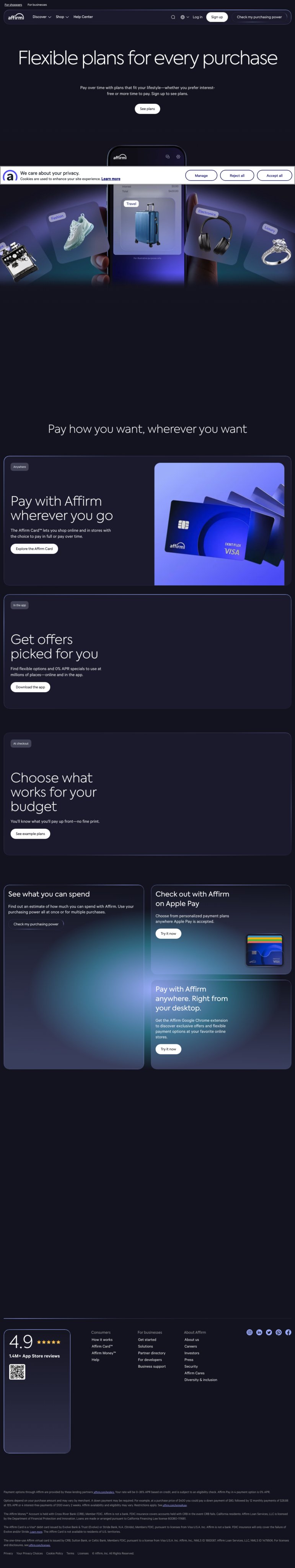
87% of users would scroll or leave — and the dominant reason is that they can't evaluate the actual cost before committing. The 4.9★ rating with 1.4M+ reviews is genuinely strong social proof, but it can't carry the page alone when users are asking 'what will this actually cost me?' and finding no answer. Seven competing CTAs fragment intent and leave users unsure which path to take. Fix pricing transparency and consolidate to one primary CTA, and this page has real conversion upside.

155sto decisionvs.4–6 weeks to reach stat sig
1,800+synthetic users tested
Design audited
Design under review
What our users said
13% engaged positively — clear entry points and straightforward product layout drive confidence

The 'See plans' button is obvious. Card, app, Chrome extension — three ways to pay over time. The entry point is clear enough that I'd click to understand the mechanics.

67% would scroll — missing early payoff terms and penalty details stalls decision momentum

The page shows the Card, the app, the Chrome extension — feels like they're trying to own my entire shopping life. But I don't see an exit ramp or clear terms on early payoff.

20% would leave — absent APR breakdown and fine print prevent financial evaluation

The page uses vague language like 'Flexible plans' without spelling out the actual cost structure upfront. Why isn't the pricing breakdown clearly displayed on the main page?

What's working

These elements tested well — preserve them as you iterate.

4.9★ with 1.4M+ App Store reviews is specific, credible social proof — prominently placed above the fold where it counts.
'No fine print' and '0% APR specials' messaging directly addresses the core anxiety of a financially cautious audience.
Zero form fields on the landing page removes upfront commitment friction — users can explore before signing up.
Affirm Card™ and phone mockups give a concrete visual anchor to an otherwise abstract financial product.
How to make this design stronger

Here's what to fix first — then resubmit and we'll verify.

critical

Add a concrete payment example above the fold

Pricing opacity is the single most-cited reason users don't convert. A visible example like '$300 purchase = $100/month for 3 months, 0% APR' would give the ~67% who scroll something to evaluate without clicking through. Users explicitly said they won't commit without running the numbers.

If you skip this: Users who can't assess cost will exit to a competitor or their credit card's 0% promo — and they won't come back.

If regulated: CFPB and TILA require clear APR disclosure near any rate claim. '0% APR specials' without eligibility criteria or a 'See terms' link adjacent to the claim is a material compliance risk under UDAP.

Suggested fix
Insert a single example payment block directly below the hero headline — e.g., white card on dark background, 16px body text: '$300 purchase → $100/month × 3 months, 0% APR. Rates from 0–36% APR based on creditworthiness.'
Add a 'See terms' hyperlink in #8B5CF6 (Affirm purple) immediately adjacent to every '0% APR' mention — minimum 12px, not buried in footer.
Place a one-line eligibility note beneath the example: 'Subject to credit approval. Not all users qualify for 0% APR.' in #9CA3AF gray, 11px — satisfies TILA proximity requirement.
A/B test the example block against the current hero: measure click-through on 'See plans' as primary metric.
recommended

Consolidate to one primary CTA in the hero; demote secondary paths

Seven CTAs compete for attention with no clear hierarchy. Users who want to convert don't know which button to press first. Consolidating the hero to a single dominant CTA — 'See plans' or 'Check my purchasing power' — and moving secondary CTAs (Affirm Card, Chrome extension, Apple Pay) to their own sections below the fold would reduce decision paralysis for the ~67% still engaged on the page.

If you skip this: CTA fragmentation will continue to suppress click-through on every path — no single conversion route reaches its potential.

Suggested fix
Designate 'See plans' as the single hero CTA. Style at 48px height, full-width on mobile, #8B5CF6 fill with white label — visually dominant against the dark background.
Remove 'Sign up' and 'Check my purchasing power' from the header nav bar; consolidate to 'Log in' only in the nav. Move 'Check my purchasing power' to a secondary position below the hero fold.
Affirm Card, Apple Pay, and Chrome extension blocks already exist as separate feature sections — ensure each has its own contained CTA and is not competing with the hero CTA visually.
Add a brief expectation-setter beneath the hero CTA button: 'No credit check to browse plans' in 12px #9CA3AF — reduces commitment anxiety for cautious users.
consider

Add one cross-platform trust signal near the social proof block

The App Store rating is strong, but it only validates iOS users. A Trustpilot badge or a single Google Play rating alongside the existing 4.9★ block would extend credibility to the ~20% of users who don't use iOS and to security-conscious users who distrust single-platform reviews.

Suggested fix
Add Google Play star rating (if ≥4.5★) directly beside the existing App Store badge — same font size, same row.
If Trustpilot score is ≥4.5, embed the Trustpilot TrustBox widget (compact version) below the App Store block — max 80px height so it doesn't disrupt layout.
Do not add security badges (SSL, SOC 2) unless they are current and verifiable — unverified badges increase distrust if users click through and find no certificate page.
Compliance & Accessibility
Compliance4 flags
APR Disclosure Proximity(Truth In Lending Act — APR Disclosure Proximity Requirement)'0% APR specials' appears in the feature card copy with no adjacent terms link, eligibility criteria, or rate range. TILA requires APR disclosures to be clear and conspicuous near the claim — not only in the footer.
UDAP Unfair Or Deceptive Claims(CFPB UDAP — Unfair Or Deceptive Acts Or Practices)'No fine print' is a broad claim that could be deemed deceptive if material terms (late fees, eligibility restrictions, rate variability) are not prominently disclosed. No mention of consequences for missed payments anywhere visible on the page.
State Lending Disclosure(State-Level Lending License And Disclosure Requirements)No state lending license disclosures or jurisdictional disclaimers visible above the footer. Several states require these to appear on the primary landing page for consumer lending products.
Social Proof Substantiation(FTC Endorsement Guidelines — Review Substantiation)1.4M+ App Store reviews claim should include the platform source and date range to meet FTC substantiation standards. Platform is noted (App Store), but no date range or methodology is visible.

Not legal advice — flags for your compliance team.

Accessibility3 notes
Footer Legal Text SizeFooter fine print appears below 10px based on visual inspection — fails WCAG 2.1 AA minimum of 4.5:1 contrast ratio and practical readability standards for legally required disclosures.
Dark Background Body Copy ContrastWhite body copy on dark navy background in the hero section may not meet WCAG 2.1 AA 4.5:1 contrast ratio depending on exact hex values — requires contrast audit with a tool like Stark or Colour Contrast Analyser.
CTA Button Contrast And Touch Target SizeMultiple outlined CTA buttons on dark backgrounds need contrast verification. WCAG 2.1 AA requires 3:1 for UI components; touch targets should be minimum 44×44px per Apple HIG and Google Material guidelines.
Re-check after fixes

Fixed some issues? Check them off, upload your updated design, and we'll verify just these findings.

Save your work and unlock re-check

Sign up free →
Deeper analysis

For your VP, stakeholders, or anyone who wants the full picture.

Did this review help you improve your design?

Generated by Prior.Run — Know before you build.