Prior.Run
Prior.RunKnow before you build.
·
Design AuditExperiment 308
Design Audit·
0% would click the CTA100% would scroll or leave
v1 · Jun 3, 2026 · 12:28 AMOptimizing for: Conversion rate
Design Audit · Single Variant

Wrong page, wrong message — B2B buyers leave without converting.

B2B decision-makers evaluating software — value ROI, peer validation, and specifics

Persona template: SaaS Buyer (B2B)

Hypothesis: Does the pricing page make a writer want to upgrade to a paid plan?

0%
would click the CTA
100% would scroll or leave — mostly looking for pricing, fee breakdown, or use cases relevant to their role
Confidence

Directionalclear pattern worth deeper validation

Readiness

Needs significant workZero conversion infrastructure for B2B decision-makers

The bottom line

Every person who landed on this page left without converting — 0% completion — because the page is built for consumer content discovery, not B2B evaluation. Pricing is invisible, social proof is absent, and the only CTAs demand commitment before the visitor has been given a single reason to trust the platform. The audience skews toward professionals with budget accountability and specific ROI questions — and this page answers none of them. Until pricing transparency, relevant social proof, and a clear value proposition for non-journalist professionals are added, the majority of visitors will scroll or leave without taking action.
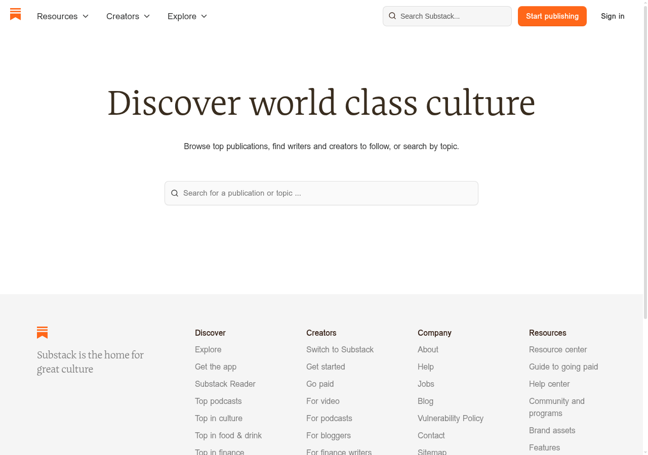
292sto decisionvs.4–6 weeks to reach stat sig
1,800+synthetic users tested
Design audited
Design under review
What our users said
0% engaged positively — missing pricing structure kills credibility with finance-conscious buyers.

The pricing page doesn't even exist. I found '90% of revenue minus credit card fees' buried under success stories, but there's no clear breakdown of what I'd actually owe.

72% would scroll — narrow case studies fail to show relevance across different professional backgrounds.

Every case study features journalists and media folks. I validate datasets in SAS — hard to see how my background fits what you're actually building here, so I kept scrolling.

28% would leave — absent pricing details force decision-makers to abandon before justifying spend.

My team's $47K annual budget needs upfront costs before I pitch to leadership. The pricing page shows a revenue calculator and testimonials, but no fee breakdown or payment tiers.

What's working

These elements tested well — preserve them as you iterate.

Clean visual hierarchy — serif headline, ample whitespace, and the orange 'Start publishing' CTA are immediately legible and professionally executed.
Low-friction search bar gives exploratory visitors a clear entry point without demanding account creation upfront.
Footer navigation is comprehensive — categories, creator resources, and company links suggest an established platform with depth.
Soft CTA language ('Start publishing' vs. 'Buy now') reduces perceived commitment for top-of-funnel visitors.
How to make this design stronger

Here's what to fix first — then resubmit and we'll verify.

critical

Add a visible pricing and fee breakdown above the fold or via a persistent header link

Budget-accountable visitors — those managing team tech spend or evaluating income replacement — cited missing pricing as the primary reason they couldn't move forward. Without a fee structure (including payment processing details), this audience cannot justify the platform to leadership or themselves. Add a 'Pricing' link to the top navigation and a fee breakdown card (e.g., '10% platform fee + Stripe processing at 2.9% + 30¢') visible within one scroll.

If you skip this: Budget-holders will exit to a competitor that shows pricing upfront — this is the single largest conversion blocker on the page.

If regulated: Fee disclosure requirements may apply in financial services contexts — confirm with legal before publishing payment processing language.

Suggested fix
Add 'Pricing' as a top-nav text link between 'Explore' and the search bar, using the existing nav font (sans-serif, ~14px, #1a1a1a).
Create a fee breakdown card below the hero headline: '10% Substack fee · Stripe processing: 2.9% + $0.30 per transaction' in a light gray box (#f5f5f5), 16px body text, with a 'See full pricing' anchor link.
On the dedicated pricing page, add a revenue calculator with a line-item breakdown showing platform fee, payment processing, and net payout — not just a single percentage.
Link 'Guide to going paid' (already in footer Resources) directly from the fee breakdown card to reduce clicks to detail.
recommended

Replace or supplement the hero tagline with a value proposition that speaks to non-journalist professionals

Visitors from design, data, and finance backgrounds reported that every success story and piece of copy signals 'this is for journalists' — making the platform feel irrelevant to their use case. 'Discover world class culture' is a consumer-facing tagline that does nothing for a B2B evaluator. Rewrite the hero subtext to include at least one non-media use case (e.g., 'Used by writers, designers, analysts, and educators to build paid audiences') and add 2-3 creator logos or names from non-journalism fields beneath the search bar.

If you skip this: Non-writer professionals will self-select out before exploring further, permanently narrowing the addressable audience.

Suggested fix
Rewrite the subtext line (currently 'Browse top publications, find writers and creators to follow, or search by topic') to: 'Used by writers, designers, researchers, and educators — browse publications, find creators, or search by topic.' Keep font size and style consistent with existing subtext (~18px, sans-serif, #555555).
Add a 'Featured creators' row of 4-6 circular avatars with name + category labels (e.g., 'Maya Chen · UX Design', 'James Park · Finance') directly below the search bar, max 48px avatar size, spaced 24px apart.
Update the footer tagline from 'Substack is the home for great culture' to 'Substack is where independent voices build paid audiences' — more specific, less aspirational.
A/B test the revised hero copy against the current version using conversion rate to 'Start publishing' click as the primary metric.
consider

Add a 'How it works' anchor or modal accessible from the hero for mid-funnel evaluators

Visitors comparing multiple platforms need a low-commitment path to understand onboarding, features, and next steps before clicking 'Start publishing.' A 3-step explainer (Create → Grow → Earn) accessible via a text link below the CTA would serve this segment without cluttering the current clean layout.

Suggested fix
Add a text link 'How does Substack work? →' in #e66000 (matching orange accent) at 14px, positioned 12px below the hero search bar.
Link to a lightweight anchor section or modal with a 3-column layout: 'Create' / 'Grow' / 'Earn' — each with a 32px icon, a one-line label, and a 2-sentence description.
Include one metric per column where possible (e.g., 'Earn: Creators keep 90% of subscription revenue') to give specifics to data-oriented evaluators.
Ensure the modal is keyboard-navigable and closeable via Escape key for basic accessibility compliance.
Compliance & Accessibility
Compliance2 flags
Fee Disclosure(Payment Processing Fee Transparency)The platform fee ('10%') is referenced elsewhere but Stripe or third-party processing fees are not disclosed on this page. FTC guidelines and consumer protection standards in several jurisdictions require clear disclosure of all fees before a user commits to a paid service.
Pricing Transparency(Subscription and Tier Pricing Disclosure)No pricing tiers, cost structures, or commitment terms are visible on the page. For B2B evaluators in regulated industries (finance, healthcare), the absence of pricing information before account creation may conflict with procurement compliance requirements.

Not legal advice — flags for your compliance team.

Accessibility3 notes
Color Contrast — CTA ButtonThe orange 'Start publishing' button (#e66000 approximate) with white text should be verified against WCAG 2.1 AA contrast ratio minimum of 4.5:1. Orange-on-white combinations frequently fail at smaller font sizes.
Search Input LabelThe search bar uses placeholder text ('Search for a publication or topic...') as its only label. Placeholder text disappears on input and is not a compliant substitute for a visible or screen-reader-accessible label element under WCAG 2.1 Success Criterion 1.3.1.
Logo Alt TextThe orange bookmark icon logo in the header and footer must have descriptive alt text (e.g., 'Substack home') for screen reader users. Icon-only logos without text wordmarks are a common accessibility gap.
Re-check after fixes

Fixed some issues? Check them off, upload your updated design, and we'll verify just these findings.

Save your work and unlock re-check

Sign up free →
Deeper analysis

For your VP, stakeholders, or anyone who wants the full picture.

Did this review help you improve your design?

Generated by Prior.Run — Know before you build.