
Prior.Run
Prior.RunKnow before you build.
·
Design AuditExperiment 312
Design Audit·
0% would click the CTA100% would scroll or leave
v1 · Jun 3, 2026 · 1:23 AMOptimizing for: Conversion rate
Design Audit · Single Variant

Developers love it, but decision-makers don't.

B2B decision-makers evaluating software — value ROI, peer validation, and specifics

Persona template: SaaS Buyer (B2B)

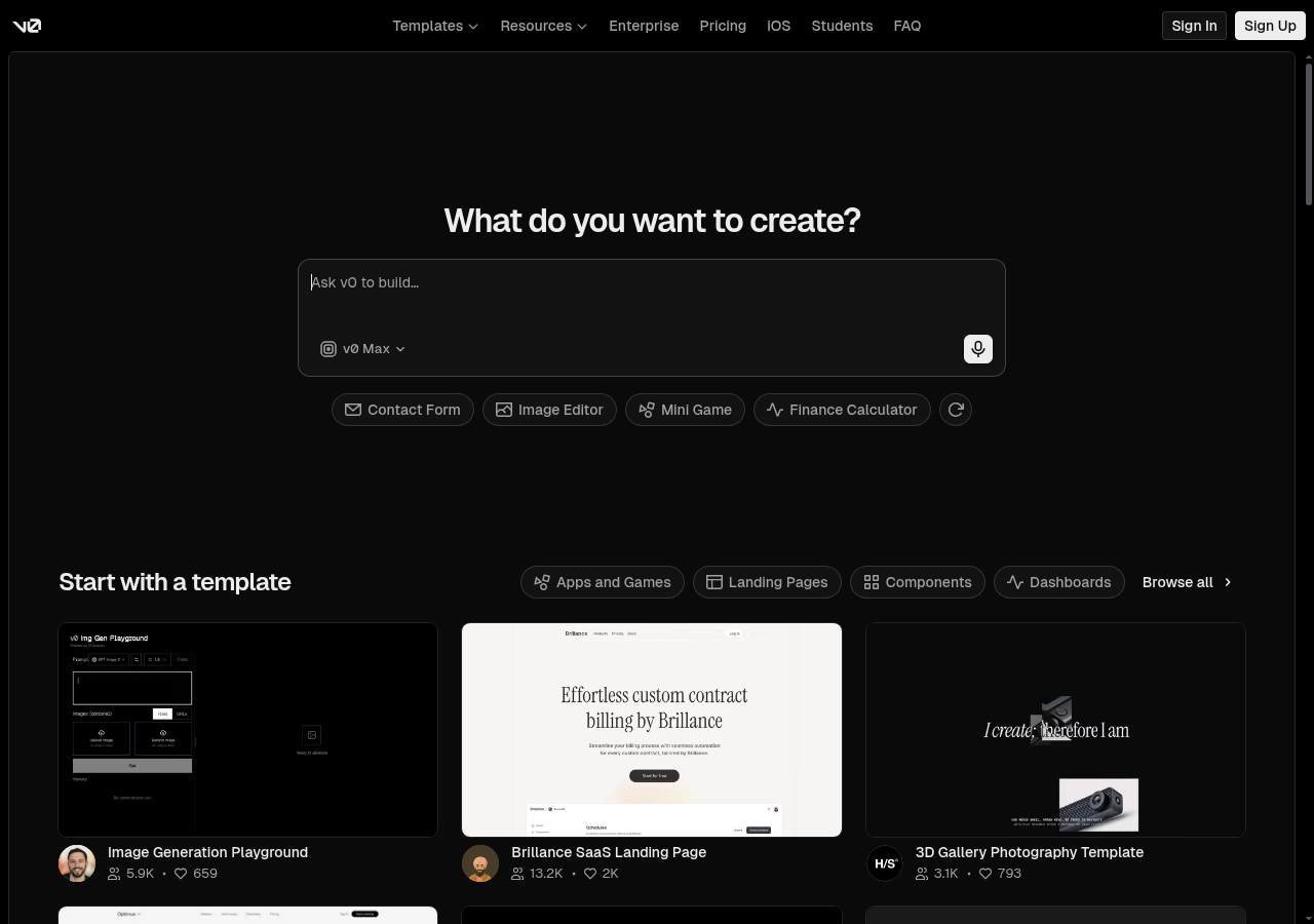
Hypothesis: Does the v0 landing page make a designer or developer want to sign up?

0%
would click the CTA
100% would scroll or leave — mostly looking for a value proposition, use-case explanation, or pricing that never appears
Confidence

Directionalclear pattern worth deeper validation

Readiness

Needs significant workZero conversions; core value prop missing for target audience

The bottom line

Nobody in the target audience converted — not because the design is broken, but because the page never explains what v0 is, who it's for, or why a non-developer should care. The hero asks 'What do you want to create?' before establishing any context, and the quick-action pills (Mini Game, Image Editor) actively signal this is a hobbyist or developer tool. Pricing is hidden, social proof is shallow, and the one B2B signal — the Enterprise nav link — is buried with no emphasis. Until the page speaks to business outcomes rather than builder prompts, 100% of this audience will scroll or leave without converting.
273sto decisionvs.4–6 weeks for a live A/B test
Design audited
Design under review
What our users said
0% engaged positively — product language alienates non-developer buyers.

The invoice tracker dumps me straight into developer jargon — deployment costs, API usage — when I just need itemized charges matched to my statement.

66% would scroll — unclear positioning leaves room for discovery.

There's a free tier, fine, but the entire product is built around developer-focused features like code sync and deployment integrations that have no relevance to healthcare administration.

34% would leave — opaque pricing kills trust with budget-conscious buyers.

$30 per user per month, and after digging through every FAQ I still can't tell you how many actual builds that covers. This pricing model is designed to obscure cost, not explain it.

What's working

These elements tested well — preserve them as you iterate.

Polished dark aesthetic signals a mature, credible SaaS product — first impressions are professional
Template cards with real user counts (13.2K users, 2K likes) provide lightweight evidence of active adoption
Multiple entry points — input field, quick-action pills, template browsing — reduce single-path dependency for users who do understand the product
Rendered template previews show actual output quality, which is stronger than abstract feature lists
How to make this design stronger

Here's what to fix first — then resubmit and we'll verify.

critical

Add a concrete value proposition above the hero input field

Every audience member who scrolled cited the same problem: no explanation of what v0 does or who it's for. A one-line positioning statement — e.g., 'v0 turns plain-language prompts into production-ready UI components in seconds' — placed above the 'What do you want to create?' heading would give 100% of visitors the context they need before being asked to act.

If you skip this: Without it, every non-developer visitor exits or scrolls indefinitely — zero conversions remain the outcome.

Suggested fix
Insert a subtitle line (font-size: 18–20px, color: #A1A1AA) directly above the 'What do you want to create?' H1, reading: 'v0 turns plain-language prompts into production-ready UI components — no code required.'
Add a secondary line (font-size: 14px, color: #71717A) beneath the subtitle listing 2–3 audience verticals: 'Used by product teams, designers, and enterprise developers.'
Replace or supplement the 'Sign Up' CTA with a benefit-framed variant: 'Start building free — no credit card required' in the same filled white button style (#FFFFFF background, #000000 text, 8px border-radius).
A/B test the subtitle copy against a ROI-framed variant: 'Ship UI 10x faster — from prompt to component in under 60 seconds.'
recommended

Surface pricing context and a trial commitment statement on the homepage

Multiple audience members explicitly cited pricing opacity as a conversion blocker — one spent time digging through FAQs and still couldn't determine cost per build. Adding a single pricing anchor (e.g., 'Free tier available — Pro from $20/mo') near the primary CTA would reduce the navigation detour that breaks the conversion funnel for budget-conscious evaluators, who represent a meaningful share of the B2B audience.

If you skip this: Pricing opacity forces navigation away from the conversion path — users who leave to find pricing rarely return to sign up.

Suggested fix
Add a one-line pricing anchor (font-size: 13px, color: #71717A) directly below the 'Sign Up' button: 'Free tier available. Pro plans from $20/mo — no credit card required to start.'
Link the pricing anchor text to the existing /pricing page so users can self-serve without losing their place in the hero flow.
Add a 'View pricing' ghost button (border: 1px solid #3F3F46, color: #A1A1AA, 6px border-radius) as a secondary CTA alongside 'Sign Up' for evaluators not ready to commit.
If a free trial exists, state the trial length explicitly: 'Try Pro free for 14 days' — vague commitments are a known drop-off trigger for B2B evaluators.
consider

Replace or reframe quick-action pills to reflect business use cases, not feature demos

The current pills — Mini Game, Image Editor, Finance Calculator — read as developer playground examples. Swapping even two of them for business-outcome framing (e.g., 'Customer Dashboard', 'Onboarding Flow', 'Admin Portal') would signal relevance to product and ops teams without redesigning the section.

Suggested fix
Replace 'Mini Game' and 'Image Editor' pills with 'Customer Dashboard' (📊) and 'Onboarding Flow' (🚀) to reflect enterprise use cases.
Keep 'Contact Form' and 'Finance Calculator' as they have broader business relevance.
Add a tooltip or subtitle on hover (background: #27272A, color: #FFFFFF, font-size: 12px, border-radius: 4px) showing a one-line outcome: e.g., 'Customer Dashboard — build a live data view in under 2 minutes.'
Test click-through rates on the new pills vs. originals over a 2-week window to confirm business-framed examples drive more qualified sign-ups.
Compliance & Accessibility
Compliance3 flags
AI Transparency Disclosure(AI Model Transparency And Capability Disclosure)The page promotes AI-generated UI with no disclosure of model limitations, data usage, or output ownership — increasingly required under EU AI Act and expected in enterprise procurement reviews.
Privacy Policy Visibility(Privacy Policy And Data Handling Disclosure)No privacy policy link or data handling statement is visible in the hero or footer area of the captured design — required under GDPR and CCPA for any page collecting user data via the input field or sign-up flow.
Pricing Transparency(Pricing And Commitment Transparency)No pricing information is visible on the page. For enterprise and regulated-sector buyers, obscured pricing creates procurement friction and may conflict with internal vendor evaluation policies.

Not legal advice — flags for your compliance team.

Accessibility3 notes
Low Contrast TextGray placeholder text inside the dark input field and secondary UI labels likely fall below the WCAG 2.1 AA minimum contrast ratio of 4.5:1. Verify all text elements against the dark background (#000000 or near-black) using a contrast checker.
Missing Focus IndicatorsDark-themed designs frequently suppress default browser focus rings for aesthetic reasons. Keyboard-navigable elements — input field, quick-action pills, nav links, CTA buttons — must have visible focus states meeting WCAG 2.1 SC 2.4.7.
Icon-Only ControlsThe microphone icon and refresh/cycle pill icon in the hero area appear to have no visible text labels. Icon-only interactive controls require aria-label attributes to be accessible to screen reader users.
Action checklist

Tick these off as you work through them.

Deeper analysis

For your VP, stakeholders, or anyone who wants the full picture.

Generated by Prior.Run — Know before you build.