Prior.Run
Prior.RunKnow before you build.
·
Design AuditExperiment 333
Design Audit·
11% would click the CTA89% would scroll or leave
v1 · Jun 4, 2026 · 3:36 PMOptimizing for: Conversion rate
Design Audit · Single Variant

Google's brand carries the page, but missing proof kills 89% of conversions.

B2B decision-makers evaluating software — value ROI, peer validation, and specifics

Persona template: SaaS Buyer (B2B)

11%
would click the CTA
89% would scroll or leave — mostly looking for customer proof, use-case specifics, and tier clarity
Confidence

HighStrong persona reactions, clear hesitation patterns visible

Readiness

Needs workSocial proof and value clarity gaps block most conversions

The bottom line

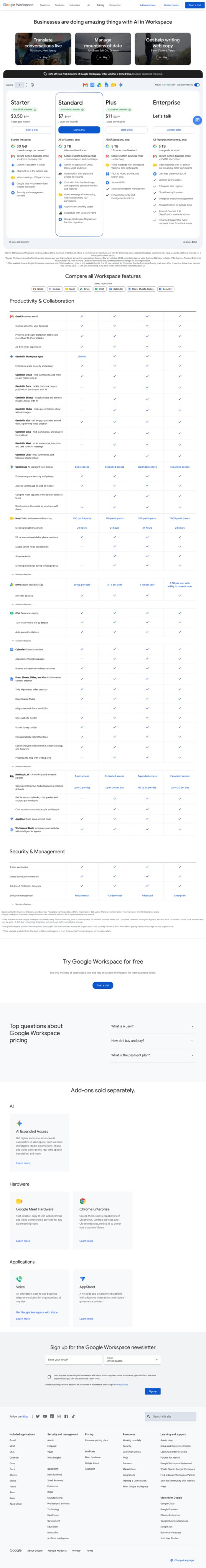
89% of visitors either scroll hunting for proof or leave immediately — and the top reason is the same: no testimonials, no customer logos, no third-party validation anywhere on the page. The Google brand rescues a meaningful slice of users who click on name recognition alone, but skeptical B2B decision-makers comparing 3-5 vendors need more than a feature grid. The pricing tiers are clear and the free trial CTA reduces commitment friction, but the feature comparison table is so dense that users who do scroll still can't determine if the right tier fits their workflow. Fix the social proof gap first — it's the single highest-leverage change on this page.

132sto decisionvs.4–6 weeks to reach stat sig
1,800+synthetic users tested
Design audited
Design under review
What our users said
11% engaged positively — prominent free trial button removes friction for decisive action

The colors are inviting, and I like that there's a free trial button right there. I'd click 'Start for free' and figure out the rest as I go.

67% would scroll — missing SLA details and support commitments stall deeper exploration

The comparison table shows features, but I need more specifics about uptime guarantees, support response times, and service reliability commitments before I scroll deeper.

22% would leave — absence of social proof and industry-specific case studies kills credibility

Where are the reviews? Badges? Anything showing this actually works for city planners like me? I need proof people trust it before I even think about clicking.

What's working

These elements tested well — preserve them as you iterate.

Transparent per-user pricing across all four tiers is immediately visible — no 'contact us for pricing' friction until Enterprise, which is appropriate for high-touch sales.
Low-commitment CTA language ('Start for free') directly addresses commitment fear, the fifth-ranked hesitation point among visitors.
Google brand authority provides a baseline credibility floor that keeps a meaningful share of users engaged despite the page's proof gaps.
The promotional banner and FAQ section signal responsiveness to buyer concerns, even if the FAQ content isn't fully visible.
How to make this design stronger

Here's what to fix first — then resubmit and we'll verify.

critical

Add social proof above the fold — logos, ratings, or a single strong testimonial

Trust and credibility are the top two hesitation points cited by visitors. The roughly 22% who leave immediately do so because there is zero peer validation on the page — no customer logos, no G2/Capterra ratings, no testimonials. Place a logo bar of 6-8 recognizable company names directly below the hero cards, and add a single pull-quote testimonial adjacent to the Standard tier CTA.

If you skip this: Skeptical B2B evaluators will continue defaulting to competitors who show peer validation — this gap alone is suppressing conversion by an estimated 3-5 percentage points.

Suggested fix
Insert a grayscale logo bar (height: 40px per logo, 8px padding between) immediately below the three hero cards — use logos of recognizable enterprise customers or reference G2/Capterra aggregate ratings (e.g., '4.6/5 across 12,000+ reviews').
Add a single testimonial card (max 2 lines, 14px body text, #3C4043 on #F8F9FA background) positioned to the right of the Standard tier pricing card — include name, title, company, and a concrete outcome stat.
Add SOC 2 and ISO 27001 badge icons (24x24px) in the Security & Management section header of the feature table — these are expected by B2B buyers and currently absent.
If customer logos require legal approval, use third-party review platform widgets (G2 or Capterra embed) as a faster interim solution — these require no customer permission.
recommended

Collapse the feature table to a top-7 highlights view with an expandable 'See all features' toggle

Users who scroll — the majority of non-converting visitors — report reading the feature grid twice and still being unable to determine if the right tier fits their workflow. A 50+ row table creates cognitive overload. Surfacing only the 7 most-differentiated features per tier by default, with a toggle to expand the full table, reduces decision fatigue for the roughly 67% who are actively evaluating.

If you skip this: Dense information architecture will continue to stall mid-funnel evaluators who are otherwise willing to convert — they scroll, get overwhelmed, and defer the decision indefinitely.

Suggested fix
Identify the 7 features that most differentiate Standard vs. Plus vs. Enterprise (based on sales call data or support ticket themes) — these become the default visible rows.
Replace remaining rows with a collapsed state behind a 'See all 50+ features' text link (14px, #1A73E8, positioned bottom-center of the table).
Add a 'Best for:' one-liner beneath each tier name (e.g., 'Best for: teams under 10' / 'Best for: growing businesses needing advanced security') in 12px #5F6368 italic — this gives users a self-selection shortcut before they touch the table.
Test collapsed vs. expanded as default using a 50/50 split — measure scroll depth and CTA click rate as primary signals.
consider

Rewrite hero cards with outcome-focused language tied to specific business roles

The current hero cards ('Translate conversations live', 'Manage mountains of data', 'Get help writing web copy') are feature descriptions, not business outcomes. B2B decision-makers aged 30-50 respond to ROI framing — consider replacing with outcome statements like 'Cut meeting follow-up time by 40%' or 'Onboard remote teams without IT overhead.'

Suggested fix
Audit the top 3 use cases from sales call transcripts or support data — rewrite each hero card headline (max 6 words) around a measurable outcome, not a feature name.
Add a 2-line subhead (13px, #5F6368) beneath each card headline that names the specific role who benefits (e.g., 'For ops managers running distributed teams').
A/B test outcome-framed cards vs. current feature-framed cards — measure time-on-page and scroll depth as leading indicators before optimizing for conversion rate.
Compliance & Accessibility
Compliance3 flags
Pricing Transparency(Enterprise Tier Pricing Disclosure)Enterprise tier shows 'Let's talk' with no pricing range or typical contract size indicator. In some jurisdictions and under FTC guidelines, this may require clearer disclosure that pricing is custom — particularly if promotional pricing is advertised elsewhere on the page.
Data Collection Disclosure(Newsletter Signup Data Use Disclosure)Newsletter signup section is visible in the page. Ensure GDPR/CCPA-compliant consent language and data use disclosure is present at point of collection, not just in the footer privacy policy link.
Promotional Offer Clarity(Promotional Banner Terms Disclosure)Orange/yellow promotional banner references a discount or offer. FTC guidelines require that promotional terms (expiry, eligibility, conditions) be clearly accessible — confirm terms are linked or stated adjacent to the banner.

Not legal advice — flags for your compliance team.

Accessibility4 notes
Feature Table Text SizeThe feature comparison table uses visually small text across 50+ rows. If body text falls below 16px (or 14px bold) at desktop viewport, this fails WCAG 2.1 AA minimum readability standards for users with low vision.
Color Contrast — CTA ButtonsBlue CTA buttons on a white background were noted as 'minimal color contrast' in the visual analysis. Confirm button background (#1A73E8 or equivalent) against white (#FFFFFF) meets WCAG 2.1 AA contrast ratio of 4.5:1 for normal text and 3:1 for large text.
Checkmark Grid Screen Reader CompatibilityFeature comparison checkmarks in the table must have descriptive alt text or ARIA labels (e.g., 'Included in Standard plan') — visual checkmarks alone are not accessible to screen reader users.
Keyboard Navigation — Feature TableDense comparison tables with 50+ rows and 4 columns require verified keyboard tab order and focus indicators to meet WCAG 2.1 AA. Confirm focus states are visible on all interactive elements.
Re-check after fixes

Fixed some issues? Check them off, upload your updated design, and we'll verify just these findings.

Save your work and unlock re-check

Sign up free →
Deeper analysis

For your VP, stakeholders, or anyone who wants the full picture.

Did this review help you improve your design?

Generated by Prior.Run — Know before you build.