
Prior.Run
Prior.RunKnow before you build.
·
Design AuditExperiment 313
Design Audit·
20% would click the CTA80% would scroll or leave
v1 · Jun 3, 2026 · 1:29 AMOptimizing for: Conversion rate
Design Audit · Single Variant

Polished product, but wrong audience and no social proof stop people from buying.

B2B decision-makers evaluating software — value ROI, peer validation, and specifics

Persona template: SaaS Buyer (B2B)

Hypothesis: Does the Linear landing page make a PM or eng lead want to start a workspace?

20%
would click the CTA
80% would scroll or leave — mostly looking for pricing clarity, customer proof, or use-case fit confirmation
Confidence

Directionalclear pattern worth deeper validation

Readiness

Needs workTrust signals and audience targeting must improve first

The bottom line

80% of visitors scroll or leave — not because the design is broken, but because the page doesn't give skeptical B2B evaluators a reason to trust it or confirm it's built for them. The embedded product demo is the strongest asset on the page, but it shows a developer-specific workflow with no explanation of who this is for. Audience mismatch is the dominant exit driver — non-engineering visitors see sprint boards and GitHub Copilot and self-select out immediately. Add social proof and sharpen the audience signal above the fold, and conversion has a real path to improvement.
329sto decisionvs.4–6 weeks for a live A/B test
Design audited
Design under review
What our users said
20% engaged positively — social proof (OpenAI customer) + frictionless auth drive immediate action

Managing programs means I live in Jira — 600 people migrating out of it in a month hit different. I'm clicking Continue with Google before I talk myself out of it.

58% would scroll — developer-centric messaging obscures relevance to non-technical workflows

I spend most mornings synthesizing feedback from agency partners into actionable recommendations — and this page keeps talking about sprints and deployments. There's nothing here about managing competing stakeholder positions.

22% would leave — missing pricing transparency and cross-team adoption friction block decision

Tracking feature requests from 14 accounts is literally my job — this shows revenue data per customer, which I've begged for. But Salesforce is Enterprise-only, and I'd need engineering buy-in. That's not my call.

What's working

These elements tested well — preserve them as you iterate.

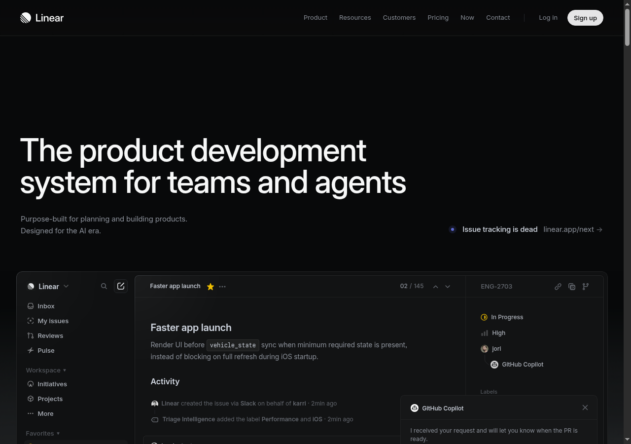
The embedded product demo shows a real, functional UI — GitHub Copilot integration and Triage Intelligence labels are visible and credible, reducing skepticism without requiring a sales call.
The headline 'product development system for teams and agents' is timely — the 'agents' framing signals genuine AI relevance to 2025 evaluators without feeling forced.
Navigation includes a 'Customers' link and 'Pricing' link, giving evaluators a self-serve path to the proof they need — even if that proof isn't surfaced in the hero.
Single-click 'Sign up' CTA with no visible commitment language keeps the entry point low-friction for the minority already sold on the product.
How to make this design stronger

Here's what to fix first — then resubmit and we'll verify.

critical

Add social proof above the fold — customer logos or a single high-credibility testimonial

Zero social proof is the single biggest trust gap for the 80% who scroll or leave without converting. B2B evaluators comparing 3-5 vendors need external validation before they'll register — social proof lifts conversion up to 34% in comparable SaaS contexts.

If you skip this: Skeptical evaluators default to incumbents like Jira where brand recognition substitutes for proof — Linear loses the comparison before the demo is even read.

Suggested fix
Place a single row of 5-7 grayscale customer logos (e.g., OpenAI, which appears in audience reactions as a known customer) directly below the hero subtext, above the product demo — target 48px logo height, 32px gap between logos.
Add one pull-quote testimonial (max 20 words) from a named engineering leader in a recognizable company, positioned left of the demo screenshot at 14px font, #A0A0A0 text on the dark background.
If logo rights are pending, add a social proof stat instead — e.g., 'Used by X,000 engineering teams' — in the same position at 16px semibold white text.
Link the logo row to the Customers page so evaluators can self-serve deeper proof without leaving the conversion path.
recommended

Clarify the 'Sign up' CTA — specify free trial, freemium, or no credit card required

The CTA asks for commitment before the page has explained cost or risk. Evaluators who are interested but not ready to register — a meaningful slice of the scrolling audience — need a low-risk on-ramp. Adding 'Free to start' or 'No credit card required' directly beneath the button removes the ambiguity that stalls action.

If you skip this: Evaluators who would trial the product instead navigate to the Pricing page and may not return to the CTA — adding an unnecessary step in the funnel.

Suggested fix
Add a 12px caption line directly below the 'Sign up' button reading 'Free to start — no credit card required' in #808080 text.
If a free tier exists, add a secondary CTA link ('Or request a demo →') at 14px below the caption for evaluators not ready to self-serve — this captures the consideration-stage audience without cluttering the primary CTA.
Confirm button label copy aligns with what the signup flow actually delivers — if it's freemium, the button can read 'Start for free' instead of 'Sign up' to reduce ambiguity.
consider

Add a one-line audience qualifier to the hero subtext to reduce wrong-fit exits

A meaningful share of exits are driven by non-engineering visitors — operations, policy, data, and account management roles — who see the demo and immediately self-identify as out of scope. A single qualifier like 'Built for software engineering and product teams' in the subtext would reduce wasted scroll time and improve signal quality for the audience that does convert.

Suggested fix
Revise the subtext line from 'Purpose-built for planning and building products. Designed for the AI era.' to 'Purpose-built for software engineering and product teams. Designed for the AI era.' — no layout change required.
Optionally, add a tertiary line at 13px in #606060 reading 'From issue tracking to AI-assisted development — in one system' to give evaluators a concrete workflow anchor.
Test the revised subtext against the original using click-through rate on 'Sign up' as the primary metric — run for a minimum of two weeks before concluding.
Compliance & Accessibility
Compliance3 flags
Privacy Disclosure Absence(Missing Cookie And Data Collection Notice)No cookie consent banner, privacy policy link, or data collection disclosure is visible in the hero section. GDPR and CCPA require disclosure at or before the point of data collection — 'Sign up' initiates data collection without visible consent framing.
AI Claims Substantiation(Unsubstantiated AI Feature Claims)'Designed for the AI era' and 'Triage Intelligence' are visible claims with no supporting explanation, accuracy disclosure, or limitation statement — increasingly scrutinized under emerging EU AI Act guidance for SaaS products.
Pricing Transparency(No Pricing Or Commitment Disclosure At Point Of CTA)The 'Sign up' CTA collects user data without disclosing whether the product is free, freemium, or paid — a dark pattern risk under FTC guidelines and a friction point for enterprise legal reviewers.

Not legal advice — flags for your compliance team.

Accessibility3 notes
Low Contrast Secondary TextThe announcement banner text ('Issue tracking is dead') and subtext copy appear in reduced-weight or muted tones against the dark background — likely below the WCAG 2.1 AA 4.5:1 contrast ratio requirement for body text. Requires contrast audit with a tool like Colour Contrast Analyser.
Product Demo Image Alt TextThe embedded product screenshot carries significant informational content (issue title, status, assignee, integrations) that would be invisible to screen reader users if no descriptive alt text is applied to the image element.
Keyboard Navigation OrderWith multiple navigation links, auth buttons, and an announcement banner link in the header, tab order clarity is critical — cannot confirm logical focus sequence from the static design alone.
Action checklist

Tick these off as you work through them.

Deeper analysis

For your VP, stakeholders, or anyone who wants the full picture.

Generated by Prior.Run — Know before you build.