Prior.Run
Prior.RunKnow before you build.
·
Design AuditExperiment 329
Design Audit·
14% would click the CTA86% would scroll or leave
v1 · Jun 4, 2026 · 3:24 PMOptimizing for: Conversion rate
Design Audit · Single Variant

Strong brand, but missing the proof that turns browsers into bookers.

Online shoppers — mix of comparison-shoppers and impulse buyers, primarily mobile

Persona template: E-commerce Shopper

14%
would click the CTA
86% would scroll or leave — mostly looking for pricing, reviews, or a reason to choose one destination over another
Confidence

HighClear audience reactions align with measurable design gaps

Readiness

Needs workTrust and pricing gaps blocking 86% of visitors

The bottom line

86% of visitors would scroll or leave because there's no pricing, no reviews, and no reason to act now. The search bar is clean and the brand is instantly recognizable — that gets users to the page, not through it. Comparison-shoppers explicitly called out missing star ratings and no differentiation from competitors. Without social proof and at least indicative pricing, this homepage is an awareness tool, not a conversion engine.
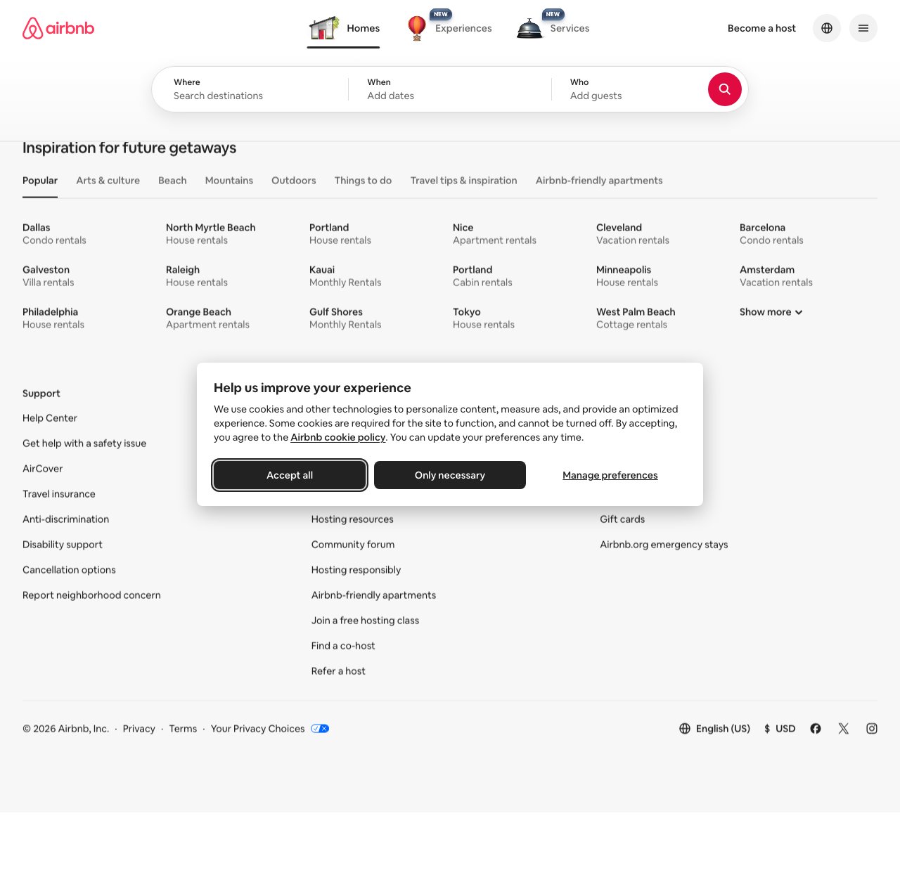
136sto decisionvs.4–6 weeks to reach stat sig
1,800+synthetic users tested
Design audited
Design under review
What our users said
14% engaged positively — clean layout and direct navigation drive immediate interest

The search bar's clean, destination grid is straightforward. Barcelona, Amsterdam — places worth exploring. One click gets me to specifics. That works.

66% would scroll — emotional framing encourages exploration despite missing pricing details

The 'Inspiration for future getaways' framing appeals to me. I'd click through the categories to explore, though I'd want pricing before committing to dates.

20% would leave — missing social proof and review badges undermine destination credibility

Where are the reviews? I see badges everywhere in retail — star counts, verified buyer tags. This page feels hollow without them. How do I know these destinations are actually worth visiting?

What's working

These elements tested well — preserve them as you iterate.

Airbnb's brand recognition does heavy lifting — users identify the platform and its purpose within one second of landing
The three-field search bar (Where / When / Who) is immediately scannable and requires no learning curve
Destination grid with named cities and rental types gives comparison-shoppers a concrete starting point for exploration
Footer trust links — AirCover, cancellation options, disability support — signal a responsible, established platform to skeptical users
How to make this design stronger

Here's what to fix first — then resubmit and we'll verify.

critical

Add star ratings and review counts to every destination card

Users explicitly flagged the absence of reviews as a dealbreaker — 'this page feels hollow without them.' Comparison-shoppers, who make up a significant share of the audience, rely on social proof before committing to any search. Adding aggregate ratings (e.g., '4.87 ★ · 2,400+ stays') to each destination card directly addresses the top hesitation cited across the audience.

If you skip this: Comparison-shoppers will exit to a competitor that shows ratings before they ever run a search.

Suggested fix
Add a star rating row below each destination card label — use Airbnb's existing pink/red (#FF385C) filled stars at 12px, followed by numeric score (e.g., '4.87') in 12px medium-weight Inter
Display stay count in muted gray (#717171) at 11px beneath the rating — format: '2,400+ stays' — pull from existing listing data aggregated by destination
Cap card height increase at 16px to preserve grid density — adjust card padding from 12px to 8px top/bottom to accommodate the new row without layout shift
A/B test the rating row against the current card design with conversion rate and click-through-to-search as primary metrics
recommended

Surface price anchors on destination cards — even a 'from $X/night' range

Multiple users said they'd explore but wouldn't commit without pricing context. Comparison-shoppers specifically need a cost signal before investing time in a search. A 'from $89/night' label per destination removes the uncertainty that's sending users to scroll endlessly or leave.

If you skip this: Price-sensitive users will open a competitor tab to benchmark costs and may not return.

Suggested fix
Add 'From $[X]/night' in 12px regular-weight Inter, color #222222, directly below the rental type label on each destination card — pull the lowest available nightly rate for that destination/category combination
If exact pricing is unavailable at page load, display a price range (e.g., '$89–$240/night') using the 10th–90th percentile of available listings for that destination
On mobile viewports (≤768px), truncate to 'From $89' to preserve card width — ensure text does not wrap
Flag cards with no available inventory differently (e.g., 'Check availability') rather than showing $0 or blank — prevents trust erosion
consider

Replace the generic destination grid intro with one urgency or personalization signal

The 'Inspiration for future getaways' heading is passive — it invites browsing, not action. Impulse buyers need a reason to act now. Consider swapping to a dynamic label like 'Trending this weekend' or 'Popular near you' to create recency and relevance without a full personalization build.

Suggested fix
Replace 'Inspiration for future getaways' H2 with a dynamic string — options: 'Trending this weekend,' 'Most-booked this month,' or geo-targeted 'Popular near [City]' — use 24px semi-bold Inter, color #222222
Add a subtle 'last booked X hours ago' micro-label to 2–3 destination cards in the grid to create scarcity signal without fabricating availability data
Test two headline variants (urgency vs. aspiration) in a 50/50 split — measure click-through rate on destination cards as the primary signal
Compliance & Accessibility
Compliance3 flags
Cookie Consent Timing(Pre-Engagement Cookie Consent Modal)The consent modal fires before users can interact with any page content. Under GDPR guidance, consent must be freely given — blocking content before any engagement creates a coercive UX pattern that regulators have flagged in enforcement actions against similar platforms.
Copyright Date Accuracy(Future Copyright Year Display)Footer shows '© 2026 Airbnb, Inc.' — a future year. While not a legal violation, it signals a template or automation error that could undermine trust with detail-oriented users and should be corrected before wider distribution.
Pricing Transparency(Absence Of Pre-Search Price Disclosure)Several jurisdictions (including EU consumer protection rules and FTC guidance) increasingly expect platforms to surface indicative pricing before users commit to a search or booking flow. No pricing visible at any point on the homepage.

Not legal advice — flags for your compliance team.

Accessibility4 notes
Cookie Modal Focus TrapThe cookie consent modal must trap keyboard focus within its bounds while open. If focus escapes to background content, screen reader and keyboard-only users cannot navigate the modal correctly — a WCAG 2.1 AA failure (Success Criterion 2.1.2).
Search Field Label VisibilityThe 'Where,' 'When,' and 'Who' labels appear as placeholder text inside the search fields. If these disappear on focus/input, users with cognitive disabilities lose context — violates WCAG 2.1 SC 3.3.2 (Labels or Instructions).
Destination Card Link TextDestination cards appear to use the city name as the link label (e.g., 'Dallas'). Without additional context in the accessible name (e.g., 'Dallas — Condo rentals'), screen reader users navigating by links cannot distinguish between cards — WCAG 2.1 SC 2.4.6.
Color Contrast — Muted Footer TextFooter secondary links and the '$USD' currency label appear in light gray. If contrast ratio falls below 4.5:1 against the white background, this fails WCAG 2.1 SC 1.4.3 (Contrast Minimum). Requires contrast audit with exact hex values.
Re-check after fixes

Fixed some issues? Check them off, upload your updated design, and we'll verify just these findings.

Save your work and unlock re-check

Sign up free →
Deeper analysis

For your VP, stakeholders, or anyone who wants the full picture.

Did this review help you improve your design?

Generated by Prior.Run — Know before you build.